Optimizing Potential Through Mentorship
Project Overview
Students and working adults alike often struggle to settle on a career path that aligns well with their passion. Even with a professional goal in mind, it can be overwhelming to achieve it without the right resources. A lot of individuals have also reported being thrown into leading or management roles without proper preparation and mentorship from seniors and supervisors, especially in the beginning phases of their career.
MentorConnect serves to address this lack of mentorship resources as it houses a wide network of professionals across various fields and professions to provide mentorship to mentees. Companies can also join as an organization to allow their employees to connect with seniors within the company and establish professional relationships with more coworkers outside their team. This way, individuals can learn about different professions as well as connect with mentors who can give them guidance no matter where they stand in their professional journey.
Duration
December 2022 - January 2023
The Problem
There are little resources for users to find mentorship in roles across different expertises in an affordable, efficient and organized manner.
Goals
-
User - Allow users to easily explore and schedule sessions with mentors fit for their professional goals
-
Business - Create a balanced mentor to mentee ratio while providing mentorship sessions at an affordable price
Research
To start off the design process, I first conducted user interviews with individuals between ages 16-40 to better understand the mindset of the product’s audience (potential mentors and mentees) through answering some key initial questions.
-
Under what circumstances would users use the app and what is their goal?
-
What are the biggest challenges users currently face in regards to mentorship in their career?
-
What is lacking or implemented well in competitor products?
-
How can we ensure a high usability of the website?
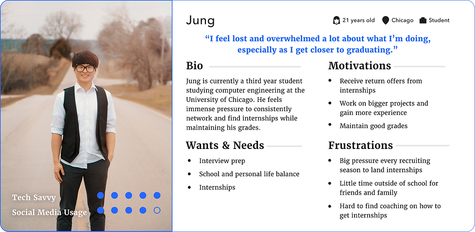
User Personas

Pain Points
Based on user research, I was able to identify the following main pain points
-
Most current mentor finder websites’s subscriptions are priced too high, especially for students
-
Difficulty in finding mentors outside of technology or business fields
-
Mentor to mentee ratio imbalance → high demand and low supply of mentors
-
Trial and error in meeting and finding the right mentor/mentee can be very time consuming on both sides
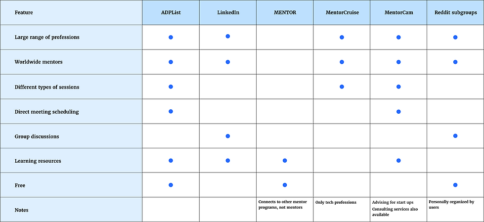
Competitive Analysis
To better investigate the current quality of mentor finding websites available in the market, I researched competitor websites and evaluated them each based on several features that users deemed essential in their journey of finding a compatible mentor.
From the market research, I was able to see which features of my competitors made them successful and which ones they lacked. I decided to base my product direction around how to
-
Provide a wide range of mentors
-
Create an easy and direct scheduling process
-
Cater to different professional fields
-
Optimize efficiency in mentor/mentee pairing
-
Incentivize mentors to join
-
Make services at an affordable price
Design
Sitemap

Wireframes
I then sketched out paper wireframes for each of the main screens of my website to better visualize how it will address the main user pain points previously identified. I followed up by transitioning the paper wireframes to digital wireframes, focusing on how to address user pain points while providing a high user experience through strategized visual element placement.
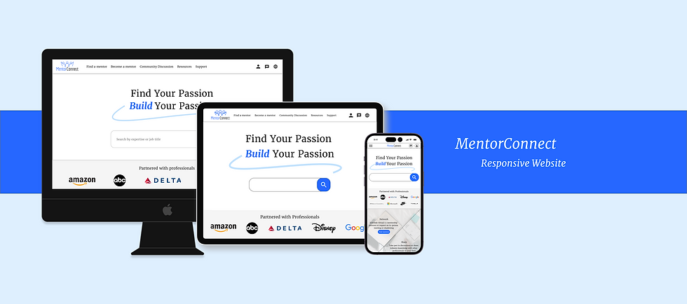
Because I intended MentorConnect’s users to be able to utilize the website on different mobile devices, I drew out designs for additional screen sizes to ensure the site would be fully responsive.
Desktop


Mobile


Usability Study
With the low fidelity prototype that includes all the screens of the primary user flow of finding and scheduling a session with a mentor, I conducted a moderated usability study and uncovered the following findings to be incorporated into my high fidelity designs:
-
Users weren’t able to communicate with each other on the website without scheduling a session.
-
Users wanted a clear way to see their upcoming sessions
-
Users didn’t have a way to mark mentors they wanted to revisit or book again for future sessions
High Fidelity Designs
Familiar Navigation
To create a direct navigation that requires minimal effort on the users’ end, I decided to place all the main user destinations at the top navigation bar.
-
Users can also easily access their user profile, messages, and language settings any time at the top of the page
-
Call to action buttons for the main user flow to explore mentors, are placed strategically throughout the homepage for users to access as they scroll
Multitude of Professional Fields
To allow users to have a one-stop access to a network of mentors from various professional fields.
-
Users can easily filter mentor list by not only field of expertise, but also by mentors’ time availability, experience level, location, and session type
-
Card layout makes browsing experience visually organized and efficient
-
Sidebar allows users to see their upcoming sessions and favorited mentors
Seamless Scheduling Process
Straightforward display of mentor’s bio, educational, and professional experience
-
Fixed sidebar for easy accessibility of mentor’s availability and session scheduling
-
Up to 6 date and time options for mentor’s most upcoming availability are displayed so users are not overwhelmed with choices
-
More availability options are shown in calendar selection if desired
-
-
Group sessions to maximize efficiency for meeting mentors/mentees and answering quick questions without committing to a full session
Increased Supply of Mentors
As a means of increasing mentor supply as well as preventing leakage of sensitive company information during sessions, MentorConnect provides organizations a separate space on the platform to provide mentorship service exclusively for employees in the company
-
Various levels of plans with different membership fees
-
Companies whose employees also join as a mentor to outside mentees will receive a discount on their membership fee


Other Screens (Desktop)


Responsive Mobile Site


Accessibility Considerations
-
Strict type scale for a clear visual hierarchy
-
Landmarks to make it easier for users to navigate the site, including those using assistive technologies
-
Text and interactive elements follow the Web Content Accessibility Guidelines (WCAG)
-
Icons are labeled with their meaning/function
Results and Next Steps
MentorConnect wasn’t officially launched to the public, but the final prototype was tested again with the initial research participants. All participants reported they were very satisfied with the simple and straightforward UI and showed no confusion or error in the user journey of scheduling a mentoring session. They were also glad to see that their initial concerns were addressed for the final product and highlighted some of their favorite features.
“This makes it so much easier to network as opposed to always just cold messaging people on Linkedin.” - Participant A
“I like how each mentor’s important details are clearly shown in their profile so I can quickly see whether or not we will be a good professional fit.” - Participant B
“I love how the community discussion creates a kind of tight knit community within the website!” - Participant C
“The resources and community discussion sections make it so fun and easy to learn because I can see interesting posts about other fields as well.” - Participant D
Moving forward, I will keep up to date with market insight as well as user feedback to continuously update the website and its design as needed. I would also like to conduct another usability study with a different set of participants to gain more insight.
Takeaways
This project brought a lot of valuable experience. I learned the benefits of responsive web design in offering a freely flowing optimized browsing experience across all screen resolutions and sizes. This is essential for both user experience and maximizing business goals by increasing the product’s access to users no matter the device they choose. In terms of design, I also learned the importance of ensuring that all aspects including layout, typography, sizing and placement of visual elements are considered and scaled properly in respect to making the product responsive and easy to use across all screens. Moreover, though not directly addressed by me, it is important to consider the backend aspects of the design, such as loading times, as well.